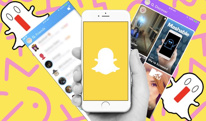
Australia Is The First To Get SnapChat’s New Update And It’s Horrible
Snapchat just updated to a whole new look and it’s ded to us. D-E-D. RIP our lit streaks.
The social media giant dropped a huge update, with Australians the first to receive the new user interface before the rest of the world. As their sample-group of testers, we can officially confirm that it sucks. It’s no good and we don’t want it.
The main difference sees all friend activity, both chat conversations and stories lumped together on the ‘friends’ screen, where the chat feature once lived. Here you can access friend’s Snapchats by clicking on a colourful circle that surrounds their profile picture. How very Instagram (I mean they probably deserve it for copying everything once great on SC).
While the new app has been simplified to have only two screens to swipe between, it’s a cluttered and confusing. The ‘friends’ section makes it hard to chronologically and quickly sort through your friend’s antics. Booo!
Here’s what the new ‘friend ‘ section looks like:
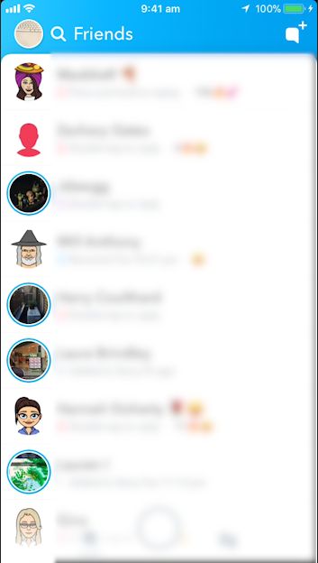
The ‘friends’ section sees all Snapchats and chat conversations dumped into one confusing and cluttered section.
Now, when you swipe right from the main camera screen, the app prioritises paid content from news outlets and brands. In between all that, they’ve squeezed in celebrity stories to keep you interested and going back for more. Credit to them, it looks slick af but we just want our chat threads and easily ordered stories in their own little place.
The new ‘discover’ brand / celebrity / news section:
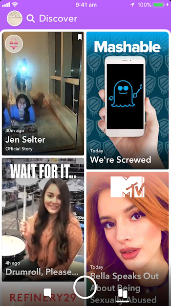
The new Discover section features celebrities, brands and paid news channels
If the past has taught us anything, it’s that the whole world is initially outraged when a beloved social media giant makes any small change. Eventually, we’ll probably all get used to it and be outraged when it changes to something else and demand this version back.
In the meantime, it doesn’t look like the new interface is copping much (if any) love from its users:
Here’s what people are saying:
How to ruin your 2018: update your snapchat
— Ashley Sorochan (@asorochaan) January 3, 2018
WARNING ⚠️ the newest #snapchat update is the worst thing I’ve ever seen. Just because I don’t snap someone doesn’t mean I don’t want to creep their story. Awful horrible terrible terrible terrible.
— lindsey (@lindseylepage) December 31, 2017
So much confusion.
I legit don’t even know how to work Snapchat anymore because they update it like every other day
— Kristin (@truthokristin) January 2, 2018
The new snapchat update is shit, I don't know how to watch people's stories ????
— Tysha Delano ???? (@Tysha1995) January 9, 2018
There were so many things they COULD have introduced:
Aye @Snapchat, make an update so we can change our usernames….can't pull any honeys with a name "chewyisbeast1" ????
— Dexter Onyekuru (@Dex_Onyek) January 9, 2018
am i the actual only person in the world that has this weird ass snapchat update. i’m confused.
— louise (@bbysart) January 1, 2018
When in panic – contact support:
hi @Snapchat @snapchatsupport idk what the fuck you did to the app but this new update is the ugliest and most ineffective layout ive ever seen. fix it or im deleting the app xx no one likes it in case ya havent realised with the abundance of hate since :))))))
— nicola (@styletotheharry) January 9, 2018
Another update but yet no re design ? @snapchatsupport @Snapchat
— Marley Erdogdu (@MarleyErdogdu) January 8, 2018
@Snapchat I used to LOVEEEE Snapchat, everything was easy to use and I could watch people’s stories in one area and open snaps in another. I’m so upset and angry that the new update is completely different. I CANT FIND ANYTHING. I’m so confused and it’s so complicated now. Part 1
— Elise O'Donnell (@eliseodonnell17) January 9, 2018
Or just vent…
This new Snapchat update is fucking annoying and I hate it.
— Meli suh ???? (@cokainemami) January 1, 2018
Are they trying to send us all to Instagram? Is Zucks somehow conspired in all this?
What even is this new Snapchat update. It’s like they are trying to make it worse
— Ben • Rustic (@Rustic_x) January 10, 2018
RIP your mad streaks.
If y’all lose streaks from me.. its cuz I dead ass got sick of this update and deleted snapchat
— Emily L (@Emilylaam) January 10, 2018
NOPE.
Snapchat update? pic.twitter.com/i6MMR6vluC
— Melissa Apostolovska (@melissaapo) January 10, 2018